Caren Lee Cares is a senior care advocacy service focused on supporting adult children navigating the care of their aging parents. Unlike a home attendant, Caren offers personalized advocacy—from coordinating services and appointments to welfare checks and emotional support.
With a premium, one-of-a-kind approach, the brand needed to communicate trust, compassion, and excellence to both seniors and their adult children.
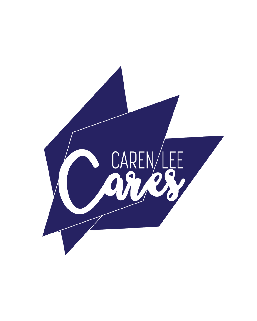
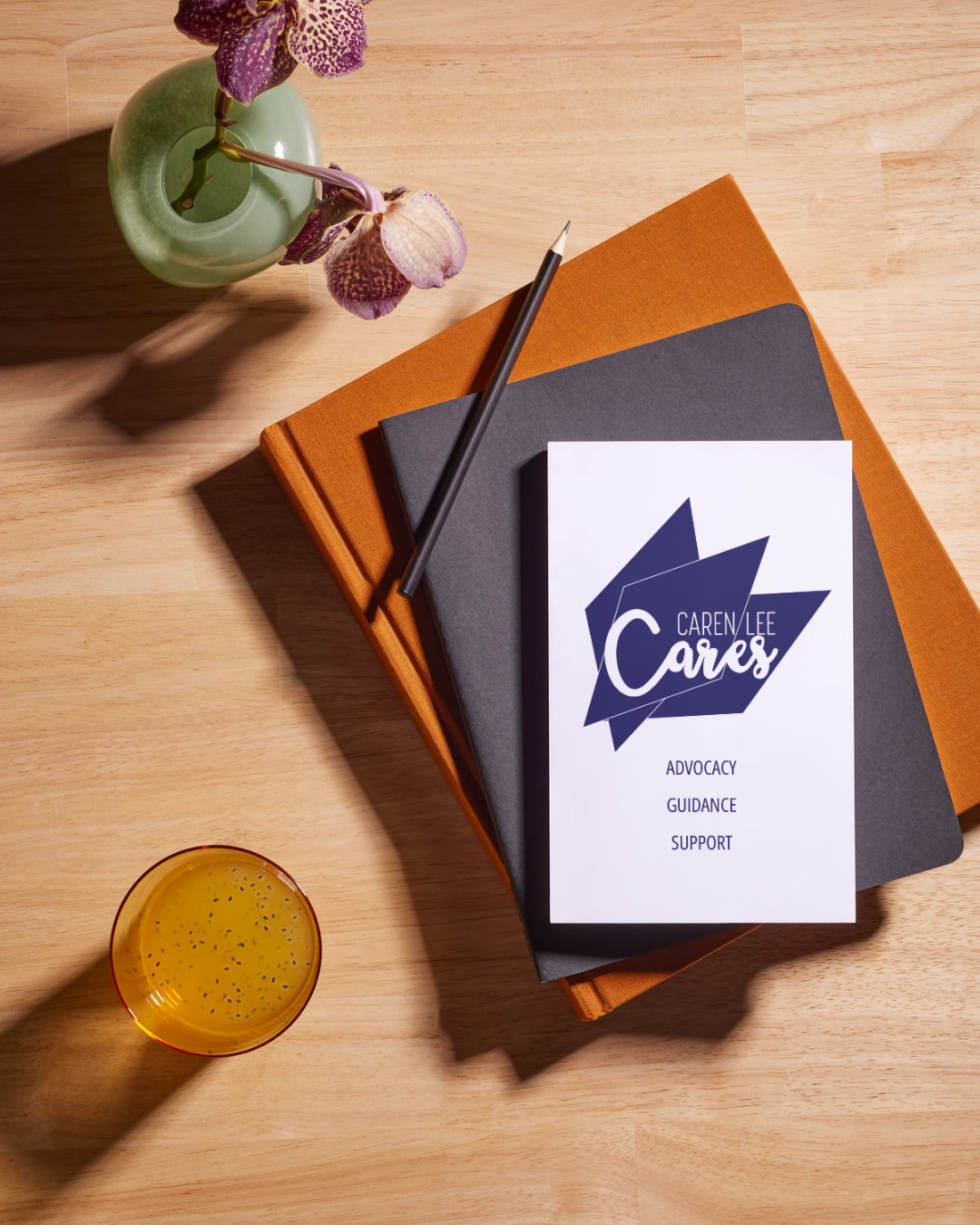
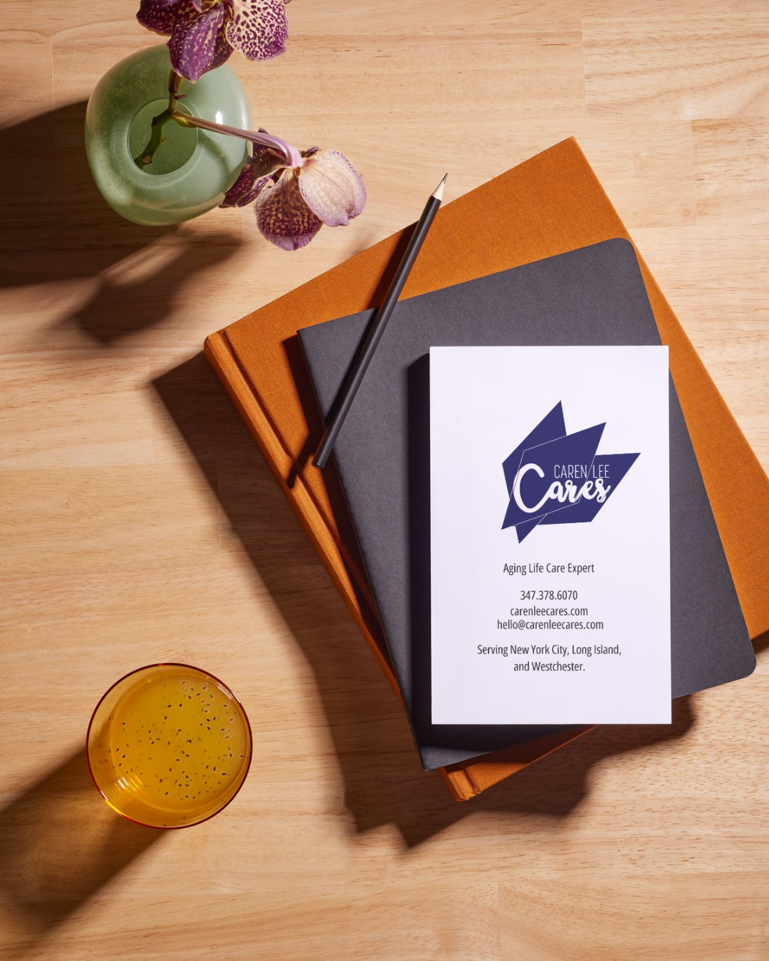
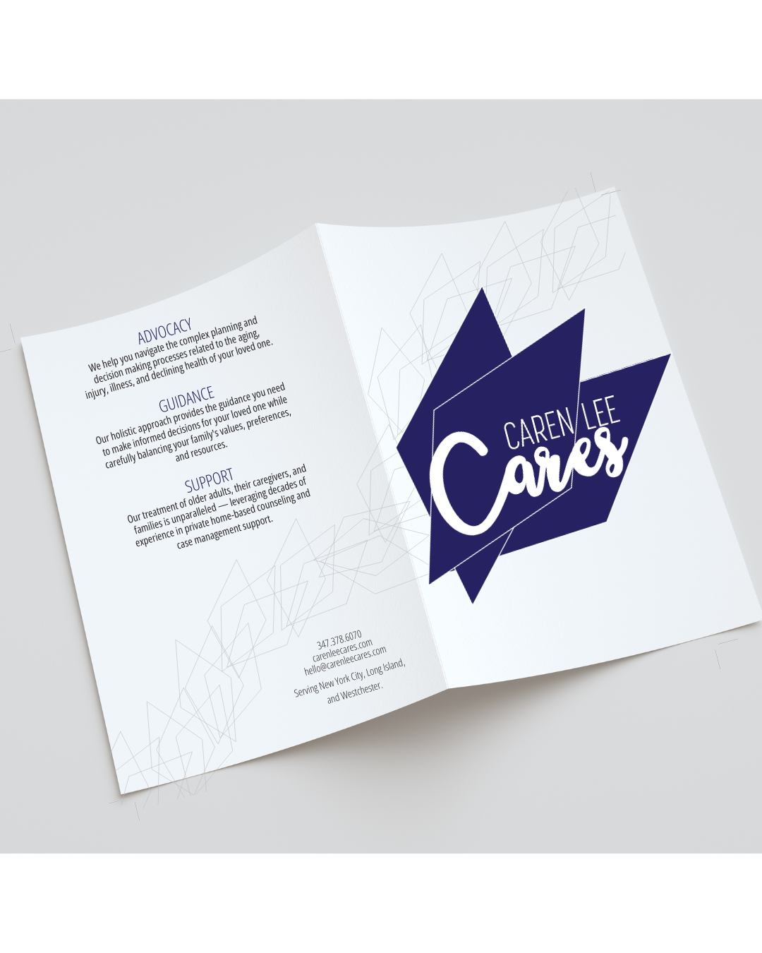
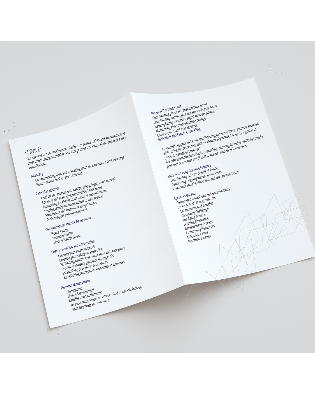
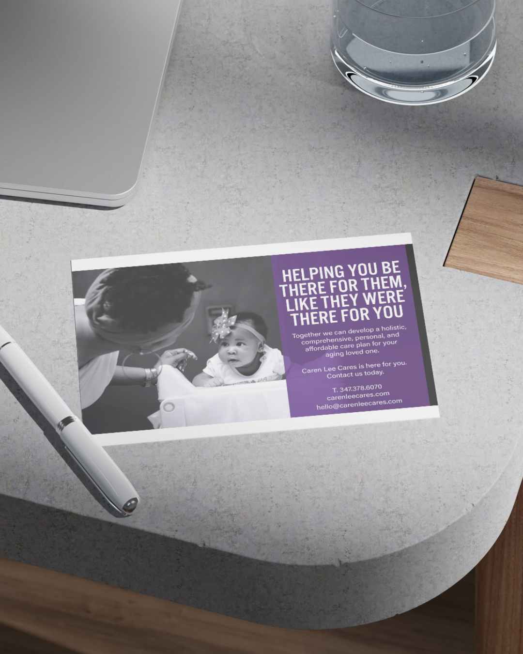
The Strength Edit created a cohesive visual identity—that reflects the rare, high-quality nature of the services: a logo and logomark featuring three purple diamonds to represent excellence, care, and value. The suite also included business cards and a folded brochure, creating a cohesive and trustworthy visual presence that communicates both professionalism and heart.
Create a brand identity that feels high-touch, personal, and professional
Design a meaningful logomark that reflects the quality of service
Develop brochures and business cards to introduce services and build trust with prospective clients
A custom logo and logomark featuring three purple diamonds, symbolizing rare, high-quality service with dignity
A folded brochure highlighting services, care philosophy, and client testimonials
Coordinated business cards with elevated details to build instant credibility
Print-ready files formatted for both digital presentation and professional printing
With her new identity, Caren Lee now presents her care services with the confidence and warmth that matches her heart-led approach—instantly standing out from more clinical or impersonal providers.
TAGS:
Branding for senior care services. Logo and print design for elder care advocacy, Visual identity for family-based decision-makers, Small business design for healthcare and caregiving. Senior Care Marketing
Let’s design print and brand materials that build trust and communicate the heart of what you do.